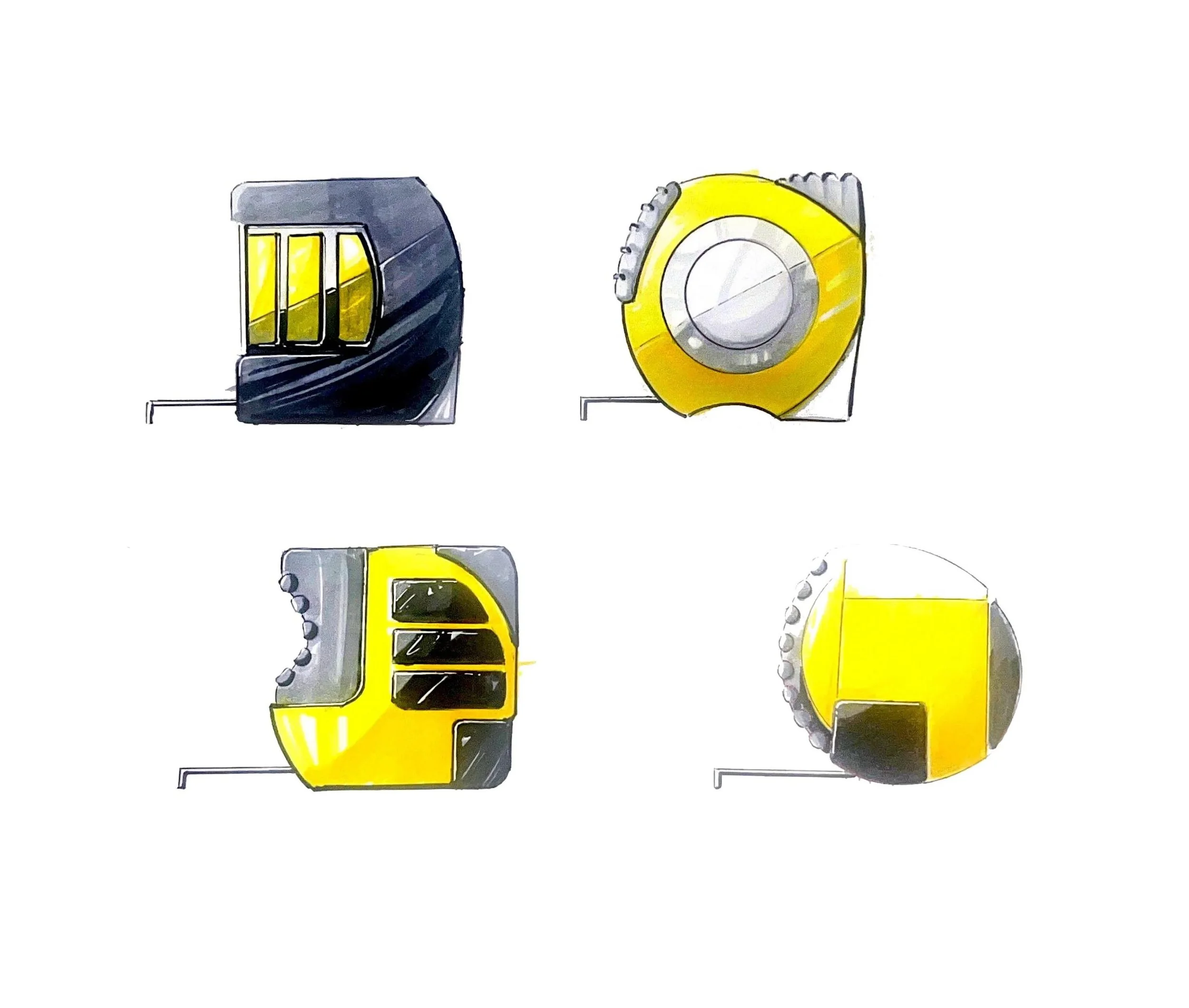
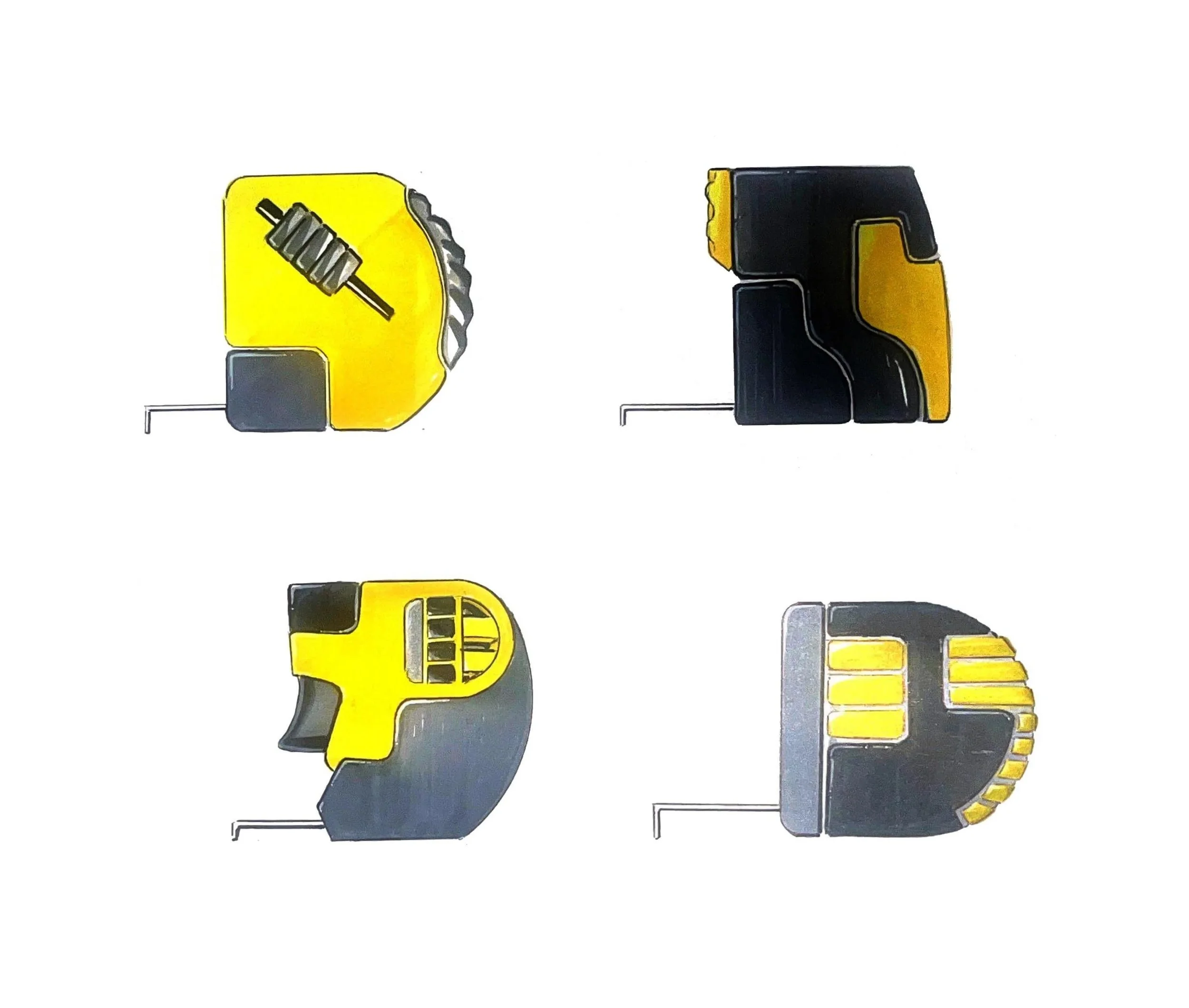
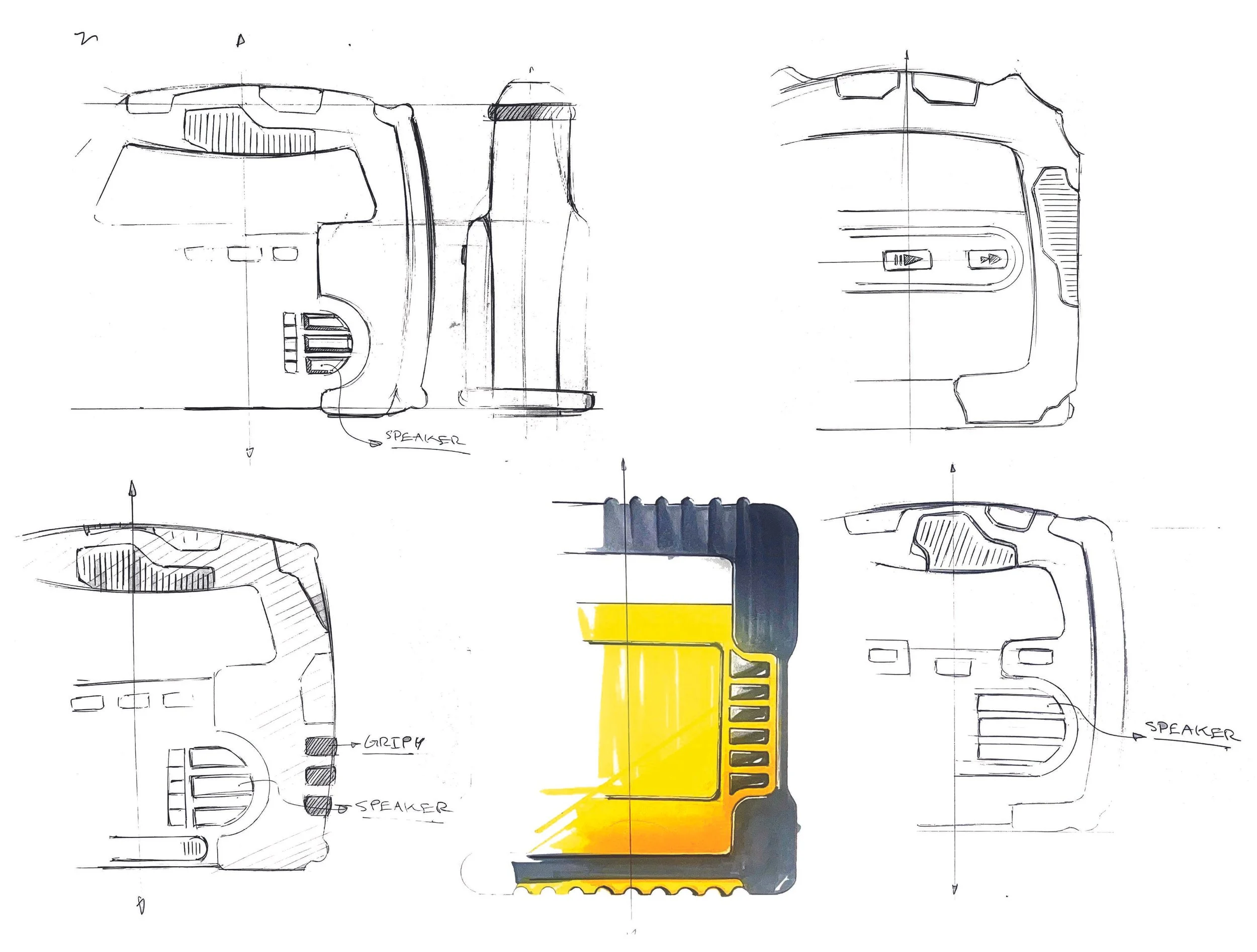
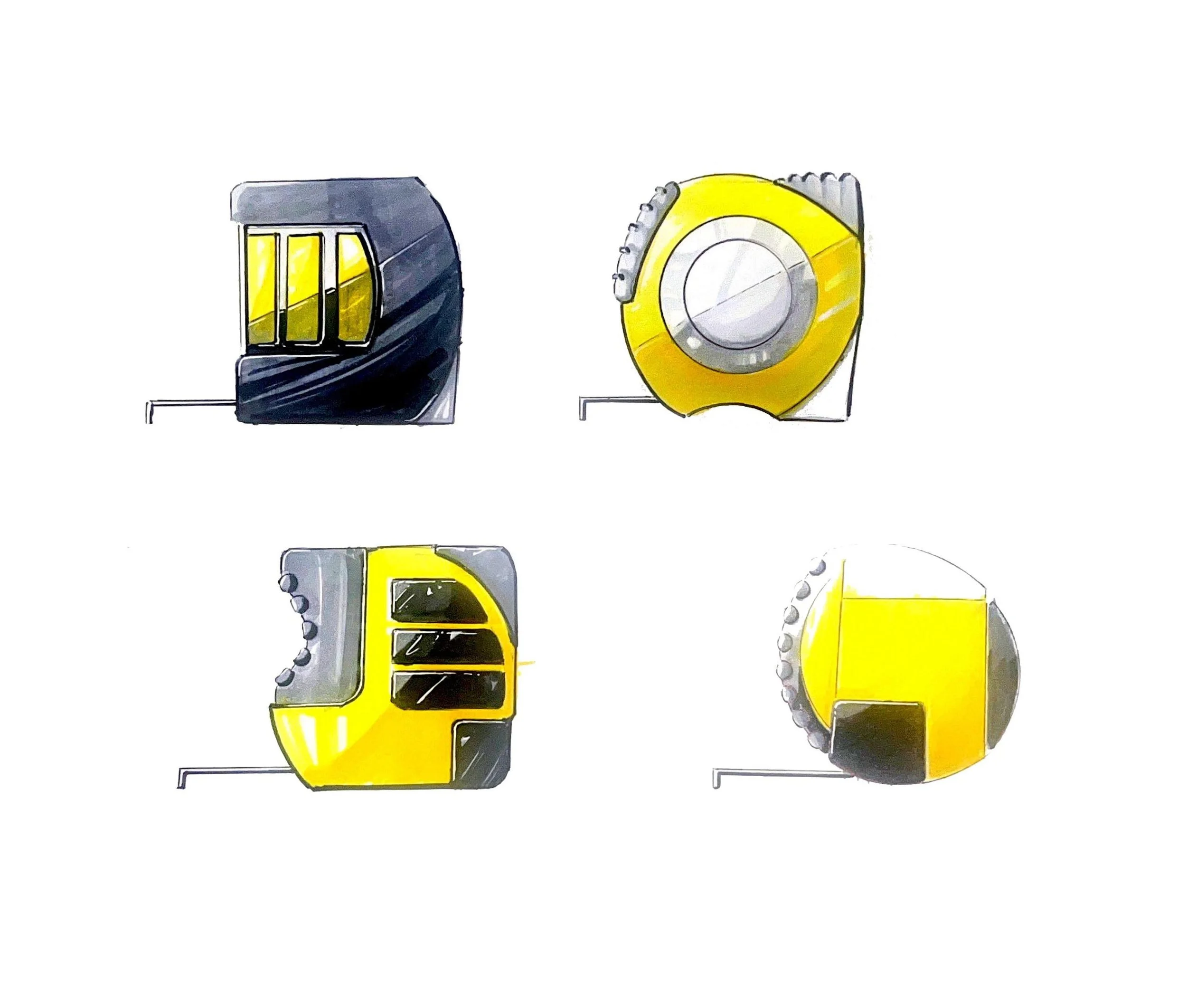
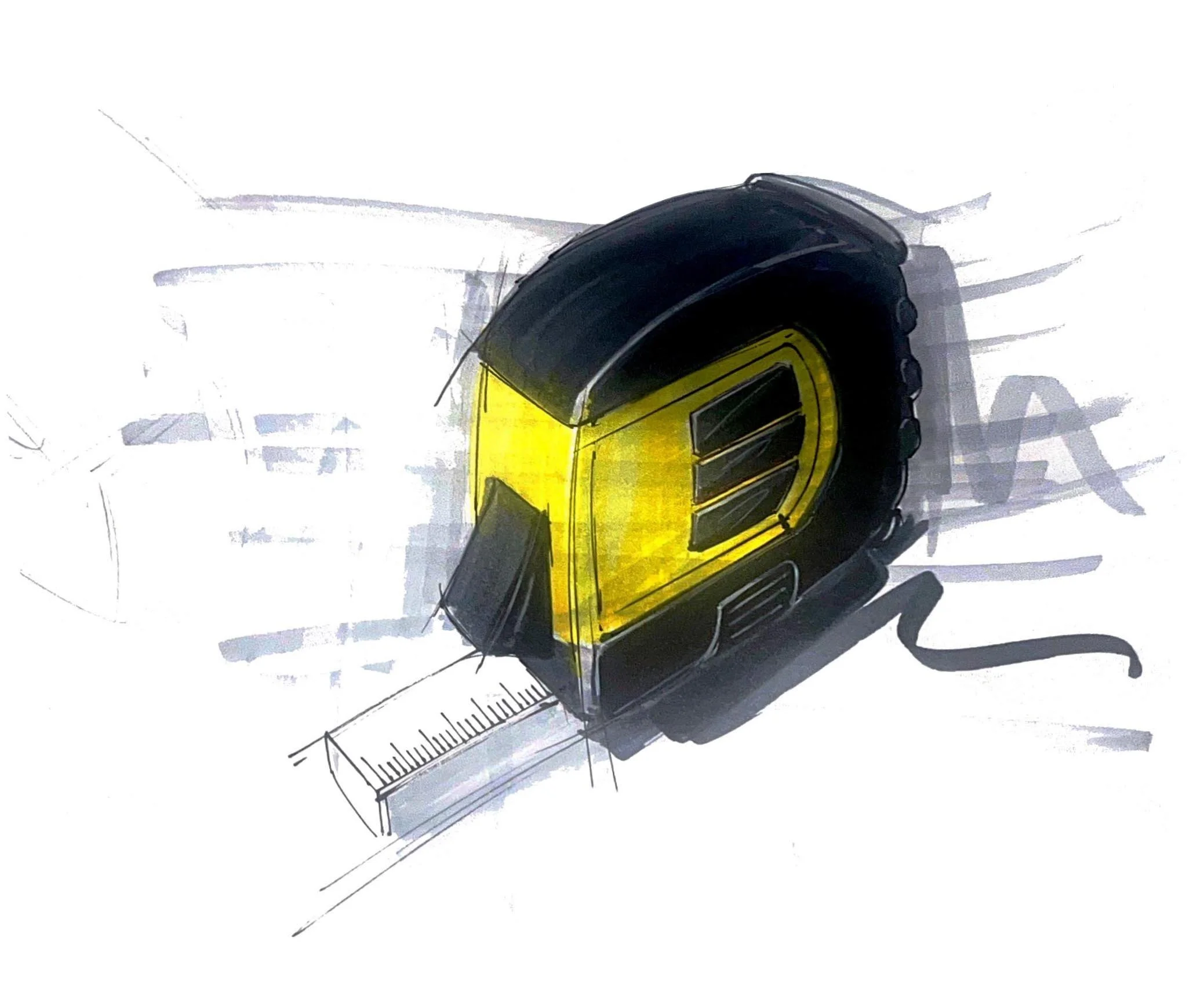
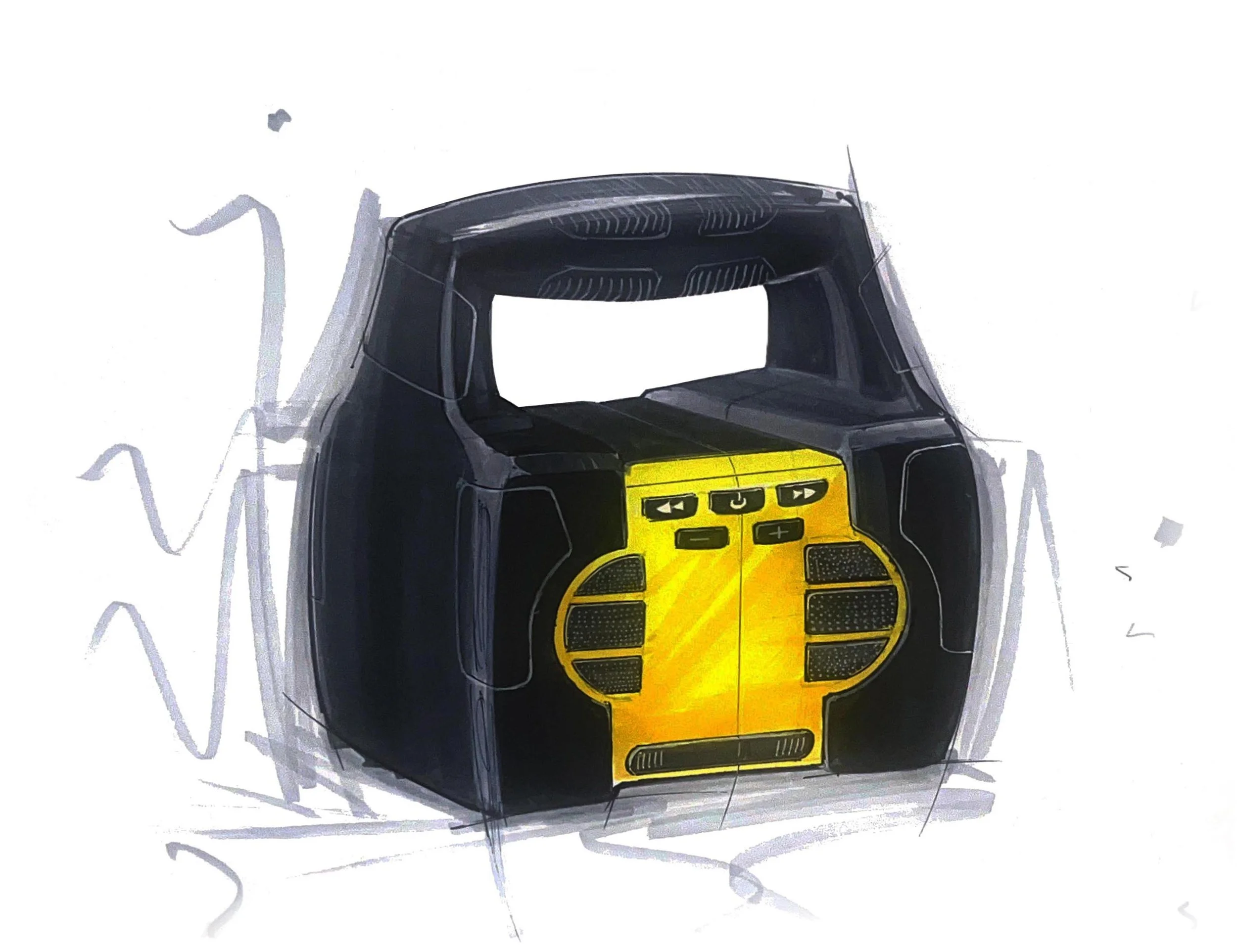
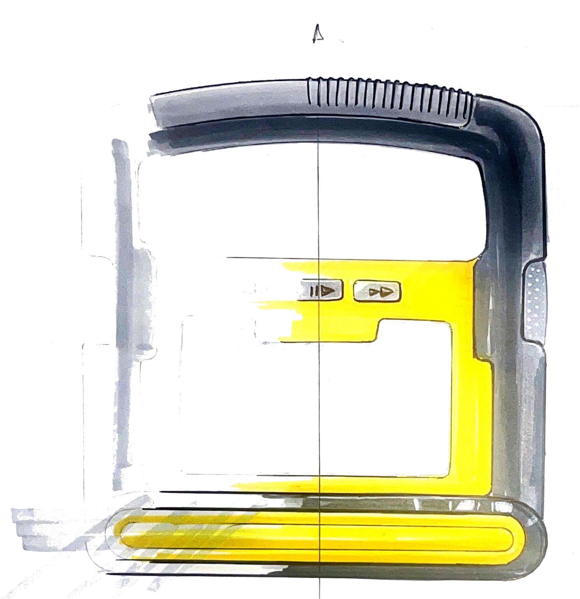
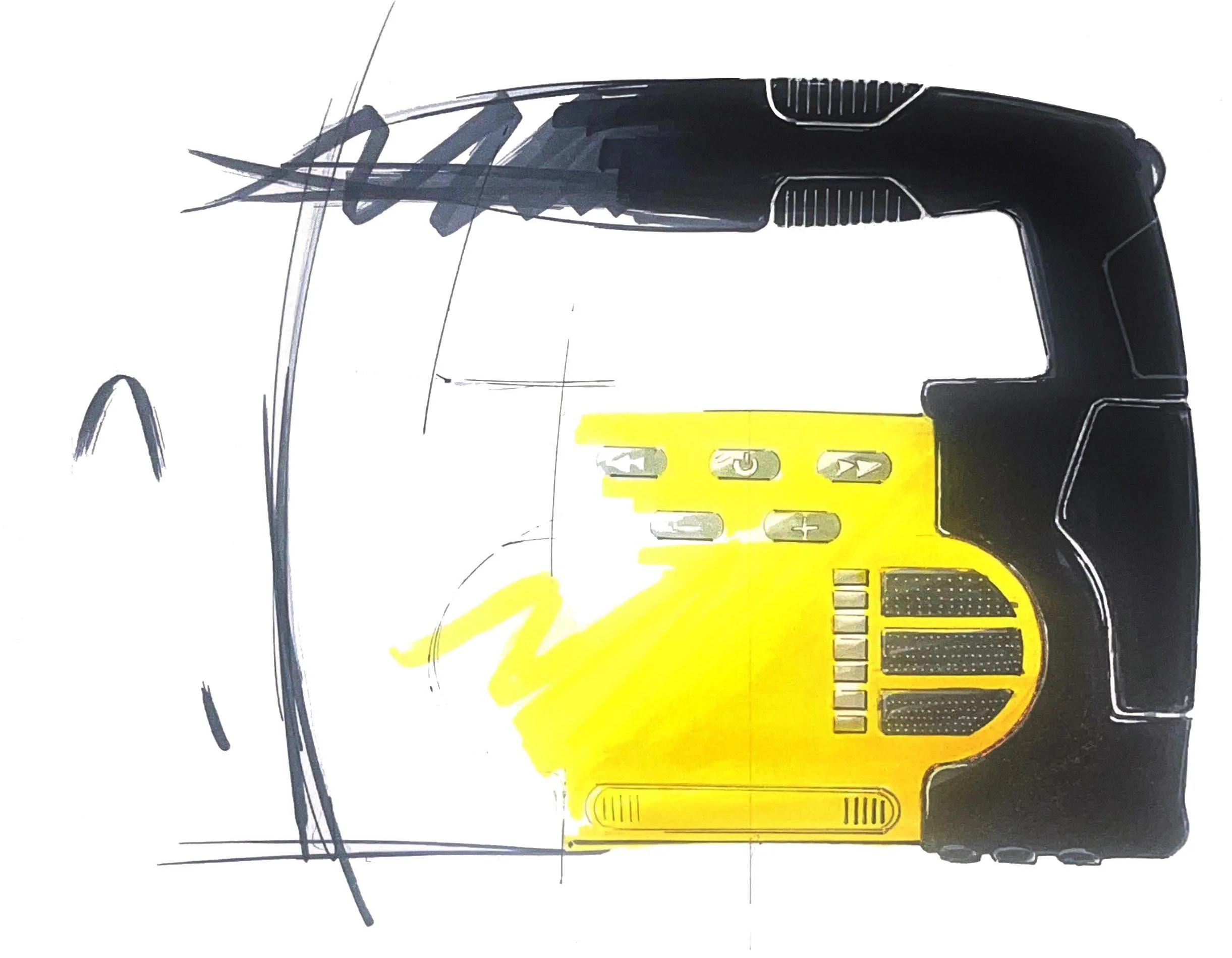
The new Tape Measure and Construction Radio reinterpret DeWalt's recognizable visual language through a more compact and contemporary form. Inspired by the brand's bold geometry, protective detailing, and distinctive surface transitions, the designs investigates how these characteristics can be integrated into a familiar hand tool without compromising its practicality. A series of sketches was used to explore proportions, grip, control placement, and the relationship between functional component, gradually refining the form toward a cohesive, durable object.
An analysis of DeWalt's history, visual identity, user base, and product portfolio, the foundation from which the designs is built.
Reading DeWalt
History & Values
A century built on the job site.
Founded in 1924 by Raymond DeWalt, the brand has spent a century committed to professional tradespeople. Its origin was the radial arm saw, a tool that revolutionized woodworking by enabling precise, repeatable cuts, establishing DeWalt as synonymous with quality and ingenuity.
In 1992, Black & Decker made a strategic decision to rebrand its professional-grade tools under the DeWalt name, deliberately separating it from consumer-grade products. A brand that has always spoken to the professional first.
Three founding principles drive everything: innovation, safety, and productivity.

DeWalt - 100 years of powering the trades, founded 1924.
Core Principle
When DeWalt puts its name on something, it is a commitment that the tool will get the job done right, on any site, under any condition.
Visual Identity
Black and yellow. Nothing surplus.
DeWalt's iconic black and yellow is one of the most recognizable color identities in the tool industry - high visibility on job sites, signaling performance and caution simultaneously.
The form language across the product line is consistent: robust, ergonomic, nothing decorative. Every surface earns its place. Grip zones are textured where hands go. Controls are large enough for gloved hands. Surfaces communicate function before aesthetics.
Design Principle
The yellow is not a style choice - it is a visibility decision. The black is not a fashion statement - it is a durability signal. Color as function.

The black and yellow - a visual system built for the job site, not the shelf.
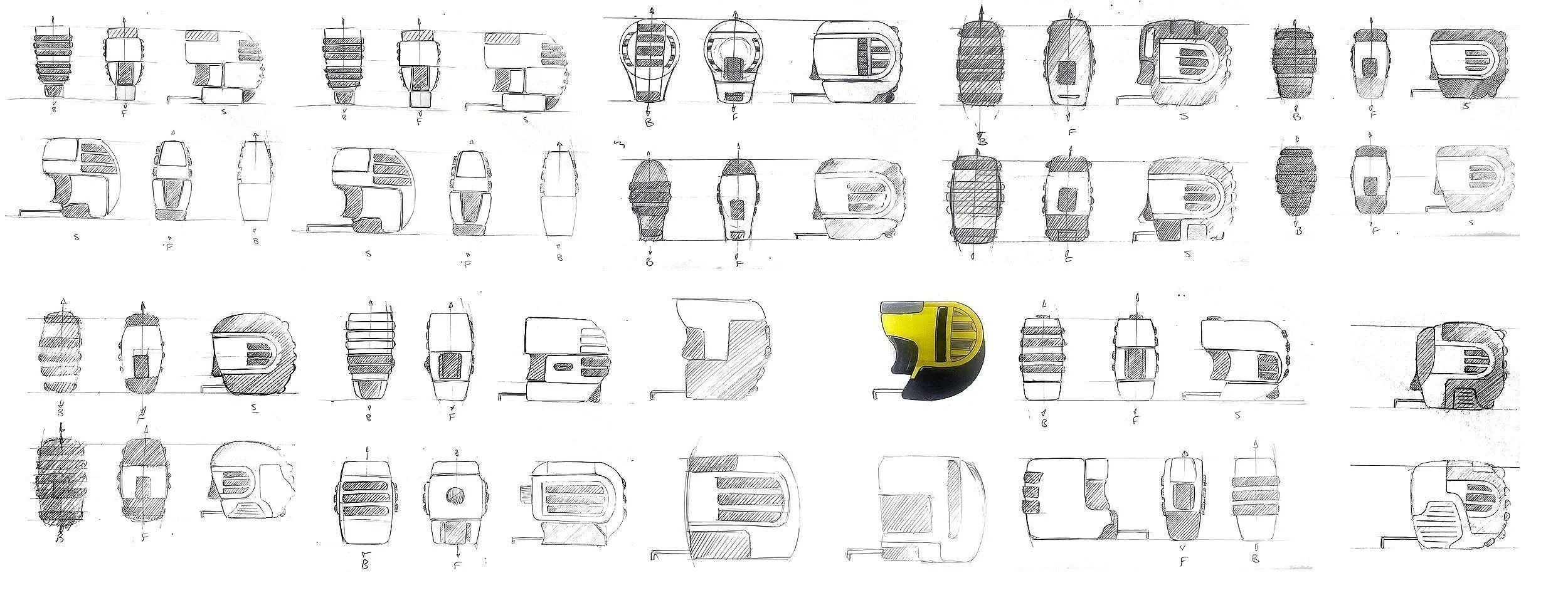
FORM EXPLORATION